
Disgruntled
A few months back, a reader of my blog (Danny), posted a comment on one of my articles about the Industry Insider Screenwriting Contest. He was “disgruntled” and more than a little baffled as to why his 15 page script didn’t make the cut — especially when he felt he was just “an inch away from opportunity.”
Seeing a chance for fans of my blog to learn from his experience, I got in touch with Danny and promised to take a look at his submission, if he allowed me to post my critique publicly on my site. I’ve been busy for the last couple of months, but finally had some free time this week, so I dove in.
While I can’t speak to the exact reasons the contest judges chose not to select Danny’s entry as one of the finalists, I can certainly offer my opinion based on my years of experience as a script consultant.
First Impressions
Question: Typically, how many pages does it take for an experienced script reader to rule out your script as a prospective contest winner?
Answer: One.
Yup, one page.
Why? Because most scripts are really poorly written — right from the get-go. If the writing is bad on page one, it rarely gets better by page 10. After all, if you’re going to make any single page in your script shine more than the others, it should be page one. That’s the critical page. That’s the page that solidifies the readers’ first impressions.
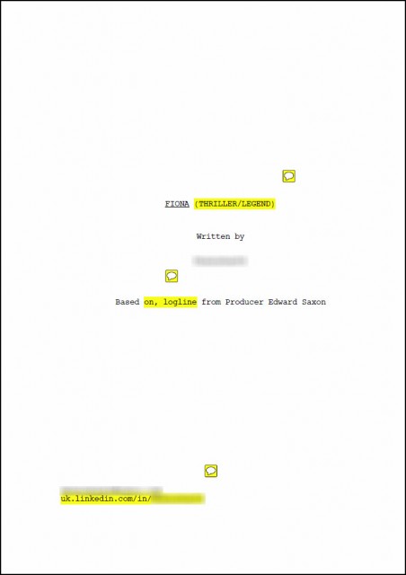
But first impressions begin with the title page itself. In Danny’s script, there were three things I highlighted on the title page alone. That’s a huge red flag.
(Click to Enlarge)
Do you see the issues?
- Danny put the genre next to the title. That’s highly non-standard.
- The “Based on” sentence has an awkward construction. It’s not even necessary to put this line on the title page.
- The title page is not the place for links to social media pages. Just provide the contact information. That means an email address and maybe your phone number.
So we haven’t even gotten to the first page of the script and there are 3 issues. Not a good sign.
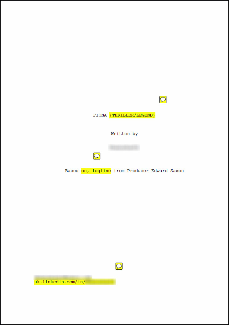
But what does the first page look like? I think the best way to illustrate this is to show you a different one first.
This is the first page of the script that ended up winning the contest for that cycle, written by J.R. Phillips. Like I did, you can download it here. Her script is entitled: THE BADLANDS: DEAD GIRLS DON’T CRY. (By the way, her title page was clean and flawless.)
(Click to Enlarge)
First page of J.R. Phillips’ Industry Insider Screenwriting Contest winning script BADLANDS: DEAD GIRLS DON’T CRY
Impressive. Only one technical issue! ONE! And even then it’s nitpicking.
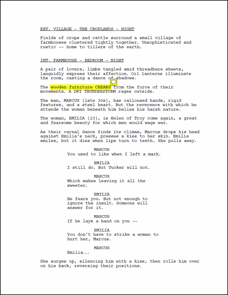
The “rule” is that if you’re going to capitalize sounds then you should capitalize the sound AND the thing that makes the sound (i.e. “The WOODEN FURNITURE CREAKS”). Again this is a minor peccadillo on an otherwise brilliantly executed first page. It certainly isn’t anything that distracts from the quality of the writing or the story itself. And this “rule” is violated all the time in professional scripts these days.
Now let’s look at Danny’s first page…
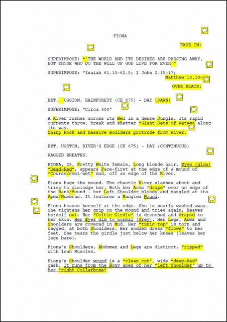
(Click to Enlarge)
Danny’s First Page from his script entitled FIONA
Yikes! See the difference?
I annotated this script, like I do with my script notes service, and it’s riddled with problems. I’ve written fifteen different notes for dozens of issues — all on page one.
Let’s take a look from top to bottom:
- If you’re going to use “FADE IN:” it should be left justified. Bonus marks: Only use one line space underneath. Not two.
- For the SUPERIMPOSE line — the use of single and double quotes is odd. I get that he wants the line to appear in quotes, but it’s better to just show what you want to appear.
- Why doesn’t the Matthew 13.10-16 reference wrap around normally onto the next line?
- “OVER BLACK:” — Aren’t we over black at the outset? What does the superimposed text appear over?
- “EXT. UGSTON” — Be consistent with your spacing. One space is preferable after “EXT.”, but if you’re going to use two spaces, then make sure you do that throughout your script.
- Scene heading modifiers like DAWN, DUSK, MORNING, etc. are rarely a good idea to include in your script. Try to stick with DAY and NIGHT. The audience doesn’t get to see the word “DAWN.” They interpret the time of day by what they see in the scene. So based on what you describe in the scene, we’ll know it’s dawn — not in the scene heading.
- What’s up with all the unusual capitalization? It makes for a jarring, peculiar read.
- ” ‘Giant Jets of Water’ ” — why is this phrase (and others) in quotes?
- “Sharp Rock and massive Boulders…” — Formatting issue. He’s missing a line space here… Or he’s accidentally hit enter.
- Be wary of underlining too many things in your script. Underlines should be used sparingly for very important elements that you need to highlight. Use underlining too much and it loses its impact (and brands you as an amateur). Note: Underlining scene headings is an entirely different issue — and it works.
- Whenever I see writers use slash and two descriptors (e.g. “Bank/Mound”), I think that they couldn’t make up their mind as to which one to use. If both are necessary, use a comma.
- Third paragraph from the bottom — isn’t Fiona already at the edge? How can she heave herself at something she’s already at? Perhaps he means that she tries to climb onto the bank and slips or something? Also — “heaves herself out” could imply that she’s pushing away from the bank. If this expression is to be used, I think it needs to be qualified as “… heaves herself out of the water.”
- Same paragraph… It’s eight lines long! It’s not technically a mistake, but it’s a big red flag. Typically, 3 or 4 lines max — especially for scene description in an action sequence.
- “Drape” and “draped.” It’s best not to use the same word in such close proximity. Same with “heaves” and “mangled” for that matter. Variety is the spice of life… and of good writing.
It came as no surprise to me that things did not improve on pages 2 through 15.
What About the Story Itself?
It doesn’t matter.
Again, I can’t speak for the Industry Insider Screenwriting Contest judges, but here’s the thing… Even if the underlying story is fantastic, there’s no way I could present this as an example of finalist-quality writing. It is, after all, a writing contest. Having a good story is only one piece of the puzzle. Great writers can:
- come up with a compelling story
- write it well
- demonstrate a command of the rules particular to screenwriting.
One out of three isn’t going to cut it, especially when there are thousands of entries to choose from.
The truth is, even beyond all of the technical mistakes, the writing isn’t very strong. I only mentioned a few things that stuck out. If I were editing this first page, there would have been many more notes.
Danny seems like a friendly, eager screenwriter, and I wish him all the best. In time, he may be able to better his writing to the point where he starts to place in contests, etc. But he’s not there yet.
The first thing I would recommend to him, and frankly any screenwriter out there, is to read and absorb a screenplay formatting book like David Trottier’s The Screenwriter’s Bible, or Christopher Riley’s The Hollywood Standard.
Proper script formatting won’t make your story any better, but it will let your writing stand on its own merits. And that’s all you can hope for.
Any other issues with Danny’s script that bear mentioning? Who can tell me why his main character introduction doesn’t work?


guess I was driven by bad screenwriting advice I gave myself through studying other screenplays.. and forums.. but thank you very much 🙂
Hi, love your site, following, just a quick question. Why is the FADE IN: on right indent wrong? I write with Final Draft and it doesn’t allow left-indented formatting. Everywhere else I’ve read and checked, people always say transitions go right. I don’t mean to doubt the validity of what you’re saying, I’m just curious. Thanks in advance.
Hi, Margie. Great question. FADE IN: is indeed a transition, and you’d think it would make more sense on the right. But it’s a special transition. I guess the best I can say is that FADE IN: on the left is the industry standard. Every book on screenplay formatting will tell you the same thing. As to why it’s that way, I have no idea. The practice has been around for longer than I’ve been writing.
Having said that, I read many modern screenplays where pros have put FADE IN: on the right (as Final Draft defaults to for some reason). No one will throw your script in the digital garbage for making this mistake, but it will probably bump most seasoned script readers. Too many bumps and your script gives the impression it was written by an amateur… which is not what you want.
So… FADE IN: on left is the way to go.
You may also be interested in this article and ensuing discussion (including a response from one of the authorities in the industry on script formatting).
One space after “FADE IN:”?
I tend to be as fair and constructive as possible, but in this case, the two must fight to work together. I think I see Danny’s vision, but only because I am here reading from the perspective of crafting a screenplay of my own. To that end, I took the time to read the introduction a few times. It is entirely disjoint, almost to the point of being incoherent. Oft times creators need unbiased eyes to experience our visions, be them prose, software, art or otherwise. Our minds cannot detach from the vision that brought the creation forth, as such, to see them for the reality they evoke in others is impossible.
The introduction is a mess, but with practice and acceptance of critique, can easily improve. I salut Danny for the energy to create and accept public discourse, and trust it all helps!